
Learn how to style the perfect coffee table.
5 complete looks with shopping links!
Design Mistake #5: Picking Paint First
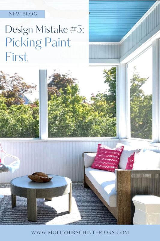
I get calls all the time from people who just bought a new home and want to book a consultation to pick out paint for their entire home. They are not that happy when I give my answer of—yes, we can do that, but it’s best to pick the paint colors last.
I get it. It is much easier to paint when you are not living in the house, and it is empty.
But the beauty of paint is that because there are so many options, you can get exactly what is needed to complete your look. Paint can even be color-matched if need be. So it is the thing that I always select last.
When designing a room, I start with the main feature—a statement rug or an overall look-like tone-on-tone—and then build from there.
I pull together all the components of the room: fabrics for the furniture and draperies, finishes on the tables and chairs, rug, etc. Once all the components are selected, then I consider the paint.
Yes, I may have an idea of what the paint will be when I’m working on the room—neutral vs. a color, a wash of color vs. a bold color—but the actual color is selected last.
Once we select colors, we get samples and look at them in the room. This is a step that so many people skip, and it’s a huge mistake.
They go to the paint store, pick a color from the swatches, and buy the paint to save themselves another trip back to the store. It may work out, but usually not so much.
A color will look different in almost every space it is in. You could paint the same color in 10 different rooms; in most cases, it will look very different.
The lighting in your room will affect how the color looks:
- Bright light vs. Low light
- North facing vs. South-facing
- Lamp light vs. Overhead light
Always get a swatch— the bigger, the better—and bring it home to see it in your space.
Look at it at different times of day and night. Even better if you look at it on different days—sunny vs. cloudy—this will give you a better read on how the color will look in your room.
 Pro tip: Looking at the paint color on a white background is essential.
Colors react to each other, so if you paint a swatch on your wall, the swatch color will react to your existing paint color and not read correctly. Putting a swatch up on a white piece of trim or a door works, or sampling on a large white poster board, leaving the edges white, will work also.
Selecting paint can be daunting at times, but when you take the time to consider your selections, the end result will be worth it. Paint brings it all together.
Want to be the first in the know for all things Molly Hirsch Interiors? Sign up for our email list.
You’ve just read Design Mistake #5. Don’t miss out on the rest of the series:
#1 Keeping Things You Don’t Love

Hi, I’m Molly Hirsch, and I help women founders, executives, and entrepreneurs translate their highly effective work approach to their home design, creating a space that rises up to meet their needs while enhancing the warmth and style of their family home. Discover all the ways we can work together to create a home of your dreams.